* EXHIBITION: 4 to 7 Threaded Studio Works for the Exhibition 40%
* CURATORIAL RATIONALE 400 Words about exhibit, philosophy, thoughts. (Part of the Exhibition)
* 500 Characters explaining each piece DUE FIRST WEEK OF APRIL
QUANTITY OVER QUALITY
EXTERNAL ASSESSMENT: (created in Powerpoint)
* PROCESS PORTFOLIO 9 to 18 Pages/Screens 40%
* COMPARATIVE STUDY of Selected Works (Three similar pieces by at least 2 artists.TWO) 10 to 15 Pages/screens 20% DUE SECOND-THIRD WEEK OF APRIL
YOU WILL ALSO HAVE TO SPEND AFTER SCHOOL TIME CREATING A GALLERY AT THE END OF THE IB EXPERIENCE AND WRITING ABOUT EACH EXHIBITION PIECE
YOU ARE ENCOURAGED TO EXPERIMENT AND SEE OTHER ARTWORK!!!!
EXPECTATIONS
IB ART- WHAT IS EXPECTED FROM YOU (and some help):
(Warning dates, may change due to Corona Virus)
BE FOREWARNED- YOU MAY HAVE TO FIND THE MATERIALS AND SUPPLIES IF WE ARE AT HOME. I MIGHT ASK PERMISSION FOR A DROP OFF FOR BOARDS AND CANVASES.
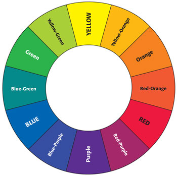
Secondary Colors - orange, violet, and green. These are made mixing any of the primary colors as explained above.
Tertiary Colors - Colors made by mixing a primary and its secondary color.
Neutral Colors - when equal amounts of two complementary colors are used, a neutral grey or brown is made.
Using the Colors
Colors adjacent (next on the color wheel), to each other are called Analogous Colors. These colors are beside each other in the color wheel such as red and orange, green and yellow, green and blue, blue and purple, etc.
Colors across from each other are called Complementary Colors. Colors such as purple and yellow, green and red (x-mas colors!), and blue and orange can be matched together.
If you try to match colors that are not Complementary or Analogous, they do not fit together as well. Try to stick to using complimentary and analogous colors as much as possible. If you want to use other color coordination besides the one's mentioned, you may do so but you might have to take up a bit of time mixing and matching.
Tips
1. When using color, you have to consider other colors as well. For example, if you use a white background as the color wheel at the top of the page, the colors in the wheel look more brighter where as the colors with the black background on the left look darker. Colors take on the "effect" of the color surrounding it - keep that in mind when using colors.
2. When you create a character, your choice of color will make the character look either a good guy or a bad guy. Good guys usually have "lighter" color clothing as opposed to bad guys which have "darker" shades of color. This does not mean that you have to give your good guy character's all pastel colors -- what it means, for example, is that if a good guy has a blue shirt then as a bad guy the shirt color will be blue also but in a darker shade.
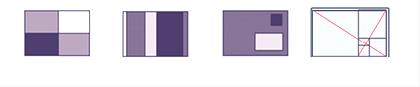
A good basic composition will often either be asymetrical or will lead the viewer's eye around the work. Some standard compositional layouts are shown above.
Quadrant-In this simple composition a dynamic balance is created by the changes in value from dark to light. There is not equal amounts of dark or light on each side.
Sequential-This simple composition is completely reliant on rhythms. Rhythm is important to all compositions in any discipline and visual art is no exception. The changing sizes and values lead a viewer across the page like changing notes lead a listener through a piece of music. Notice that there are not any two areas that are the same size. This helps to create an asymmetrical balance. Other types of sequential compositions rely on mathematics, like the Fibonacci Sequence.
Asymmetrical-Also referred to as Dynamic Balance. This sort of composition relies on creating balance between the two sides of the picture. In this picture the negative space, or area on the left where there is no rectangular object, has equal visual weight to the right side. Think of it as you would a scale. On one side of the scale there is eight one-ounce cubes and on the other is two four-ounce cubes. They both weigh eight ounces, but look different. In a compositon this could be shown as two large dark squares and eight light squares. Try to move the elements around the compositon to lead the viewer around the composition. The use of one shape, color, line etc. is called repetition of an element and helps to create connections between objects in a composition. This compositional style also shows up in sculpture.
Golden Mean (or Fibonacci Sequence used in a spiral)-This mathematical composition is created from a 1 to 1.618... ratio. You will find this particular ratio works well in creating an interesting balance in a picture. The system is made up of a series of square areas which diminish in size and curve in toward the center, much like a snail's shell. One can recreate a similar instance of this by starting with a 10 inch by 16 inch rectangle. Divide a square section on the left side with a vertical line. Draw a line from corner to corner. At the point that the diagonal meets the vertical line draw in a horizontal. Draw another diagonal from the top right corner to the bottom of the vertical line. Draw a vertical from the point where the diagonal meets the horizontal line and continue the process until the squares become too small to work with.
Most compositions do not adhere only to one of these models, but use a combination of two or three to help carry a viewer through more complex pathways.
The trick is to strike a balance between unity and variety. Too much unity and the design can look boring and repetitive; too much variety and it can look chaotic and disconnected. Understanding gestalt concepts can help a designer control unity and variety.
PAINTING TIPS:
• Positioning of Elements in a Still Life
Don't position the objects you want in a still life in a straight row – they'll look like soldiers on parade. Rather stagger them – but not at equal distances from each other! Or if you really want them in a straight row, overlap them or paint them from an usual angle, such as straight on or from above.
Looking at a painting in a mirror also helps you see mistakes or areas that need working on.
• Folding a Card
If you want to make a card from a piece of ordinary printer paper, fold it in quarters, not just in half, as then it'll stand up well. Even better, glue it in half, then fold again.
• Squint to Make Out Forms
If you squint your eyes, the light and dark areas in whatever you're painting will become more obvious. It also eliminates some of the detail, which you can probably leave out of your painting too.
• Placing Elements in a Painting
If you can't decide where to place the elements in a painting, make some quick sketches of them, cut these out and then move them around on a sheet of paper until you get a composition that works. Then stick them down so they don't accidentally move again!
Leave a Blank Border Around Your Painting
Leave a white border around the edge of your painting. It not only gives you somewhere to 'test' your colours, but it means that when the painting is framed you won't loose any of it under the mounting board.
• Don't Fill in the Spaces
Once you've drawn your subject on your canvas, don't fill in the "shapes". The drawing isn't there to help you paint-by-numbers; it's a starting point not the end product.
Overcoming an Intimidating Blank Canvas
it can be quite intimidating when faced with a blank, white canvas. To get over this block, wash the whole canvas in a colour you like working with, using a sponge. This will help to overcome fear and rigidity. Even if this underwash is not quite in line with you had in mind for your end product, you can always paint over it!
• Look at a Painting Upside Down to Spot Mistakes
When you feel that something's not right in your painting but can't figure out what it is, turn it upside down. This way your brain is more likely to see the shapes rather than interpreting them into the subject of your painting, and it's easier to see which bits aren't working.
.
COLOR!
Basics
The color wheel is comprised of main colors: red, purple, blue, green, yellow, and orange. Some color wheels have an inner ring which are pastel versions of the main colors and a third outer ring - would have darker variations)
The colors orange, red, and yellow are known as the warm colors. These colors are bright, cheerful, and are associated with anything hot which is why they are called warm colors.
Purple, blue, and green, on the other hand are the cool colors. These three colors are are often used in shadows among other things which is why they are called cool colors.
Terms
Some useful terms that you should familiarize yourself with:
Hue - A pure color; the color itself (red, yellow, blue, etc.)
Intensity - refers to the brightness of a color. In order to lower a colors intensity (dull down), add a small amount of its complement; its opposite color (more about complements later). For example, to dull down red, add a bit of green. If equal amounts of red and green are mixed, the color becomes brown not a dulled down red.
Value - refers to the lightness or darkness of a color. For example, to lighten a color add white.
Primary Colors - red, yellow, and blue. They are the basic colors that make up all the other colors of the color wheel. For example, if you mix red and yellow - you get the secondary color: orange. Mix red and blue - you get purple. Mix blue and yellow- you get green. And from there you can create tertiary colors like turquoise (a blue green color) or fuschia (a red purple color).
IF YOU HAVE MULTIPLE JOBS, IB DIPLOMA, OR DO NOT HAVE ANY EXTRA AFTER SCHOOL TIME, FOR THE EXTREME DEMANDS OF THIS COURSE- DO NOT CHOOSE IB ART FOR AN ADVANCED CLASS. TAKE AN ADVANCED CLASS INSTEAD.
IB ART- WHAT IS EXPECTED FROM YOU:
·You must be open to OFTEN RESEARCHING artists and art techniques.
·This will be the most time-consuming class. You will NEED AFTER SCHOOL HOURS, to get everything needed done.
For every hour you’re creating art in school, you should be researching, writing and drawing TWICE (2 hours) as much per day (obviously can be made up during weekends).
·This is NOT An entire year course, this is a ¾ year course. Everything will be done by APRIL!
·All work MUST be finished by first week of APRIL unless notified earlier. You MUST be self-discipline with your time, and have a plan. IB DOES NOT CARE ABOUT EXCUSES.
Potential Mediums:
Well the usually such as: Pencil, charcoal, acrylic, pastels, markers. But you CAN get creative in the mediums, but they should reflect the overall concept of the piece and NOT just to put something weird or unique in the piece. AT first GO WITH YOUR STRENGTH! Your best medium, and then deviate.
`Unique ides for other mediums example:
A student created a monstrous hand, grabbing a painted face on canvas that's popped out from it. She used, cardboard, toilet paper, newspaper, paper clay, oil-based clay, and paint, not to mention- a variety of glues including epoxy.
Another student went to Home Depot, and took a massive amount of colored paint sample that are free. She cut them up real small and mimicked the tile/mosaic look of Roman art while rendering a polar bear.
A girl made a large beach ball-sized apple out of newspaper, covered in plaster. She used a twig as a steam and crushed Christmas ornaments as covering for the leaves. To create texture within a simplistic Pop Art piece.
HOW TO GET A HIGH SCORE:
LOOK AT THE CRITERIA FOR GRADES. SEE WHAT IS NEEDED.
•One of the IB mark-bands is “Artwork is directly personal to the student” if you don't do this, you will never obtain a high score.
•Criticize yourself!!! In your Process Portfolio reflect on what your created. As horrible as it sounds, it is great to write down “I need to improve on my painting skills, they are definitely not the best”....it shows the examiner that you are aware of your weaknesses and are willing to work on them.
•Go to art museums/galleries and record your visits on your IWB... IB loves to see you exploring the world of arts. I recommend the Menil Collection... http://www.menil.org/ It is so much nicer to see art work in person.
•Your studio pieces should ideally be more challenging and conceptual as time passes by. Don't expect to get away with the same level of challenge all year. That will not get you a high score. If you want to score high, your later pieces should not only be of deeper meaning, but should involve more craftsmanship. This shows your progress.
* YOU ARE IN IB ART NOT TO JUST DRAW WHATEVER YOU WANT FOR ZERO REASON.
* BE HONEST! INSIGHTFUL. LAYER THE MEANINGS IN YOUR WORK!
* NO THEMES! Only Threads, one work should FLOW into the next, with either a lot of flow or it can be subtle. Threads can make an exhibition tell a story, or relate within each other without just all images being about one subject matter.
A few of the more common types of Art:
Abstract: Abstract artists felt that paintings did not have to show only things that were recognizable. In their paintings they did not try to show people, animals, or places exactly as they appeared in the real world. They mainly used color and shape in their paintings to show emotions. Some Abstract art is also called Non-objective art. In non-objective art, you do not see specific objects. It is not painted to look like something specific. Sonia Delaunay Jackson Pollock
Cubism: Cubism is modern art made up mostly of paintings. The paintings are not supposed to look real The artist uses geometric shapes to show what he is trying to paint. Early cubists used mainly grays, browns, greens, and yellows. After 1914, Cubists started to use brighter colors. Cubism was the beginning of the Abstract and Non-objective art styles. Pablo Picasso Marc Chagall Georges Braque
Expressionism: In Expressionist Art, the artist tries to express certain feelings about something. The artists that painted in this style were more concerned with having their paintings express a feeling than in making the painting look exactly like what they were painting. Marc Chagall Wassily Kandinsky Ludwig Kirchner
Fauvism: Fauvism was an art style that lasted only four years, beginning in 1905. The leader of this movement was Henri Matisse. The word Fauvism is french for "wild beasts". It got this name because the paintings had bright and unusual colors. The subjects in the paintings were shown in a simple way, and the colors and patterns were bright and wild. Henri Matisse
Impressionism: Impressionism was developed in France during the late 19th and early 20th centuries. These pieces of art were painted as if someone just took a quick look at the subject of the painting. The paintings were usually in bold colors and did not have a lot of detail. The paintings in this style were usually outdoor scenes like landscapes. The pictures were painted to look like they were shimmering. Claude Monet Mary Cassatt Pierre Auguste Renoir Camille Pissaro.
Pointillism: In Pointillism, the artist uses small dots or strokes of paint to make up the pictures. From far away, these dots blend together to form the picture and give the impression of different colors as they blend together. Paul Seurat Paul Signac
Pop Art: Pop art can be any every day item that is drawn in a brash and colorful way. Pop Art is short for Popular Art. It is inspired by comic strips, advertising, and popular entertainment. Andy Warhol
Roy Lichtenstein Claes Oldenberg David Hockney
Post-impressionism: Postimpressionism began in the 19th century. It was mainly still lifes and landscapes. The postimpressionists liked to use lots of colors and shadows. Vincent Van Gogh
Henri de Toulouse-Lautrec Paul Gauguin Paul Cezanne
Primitivism: Primitive Art looks like art that is done by a child. Usually the picture is painted very simply, and the subjects are "flat", or two-dimensional. Paul Klee Henri Matisse
Realism: Realism is a type of art that shows things exactly as they appear in life. It began in the 18th century, but the greatest Realist era was in the mid-19th century. Most Realists were from France, but there were some famous American painters who were Realists also. Henri de Toulouse-Lautrec Leonardo Da Vinci Gustave Courbet Honore Daumier Thomas Eakins
John Singleton Copley
Surrealism: Surrealists paintings were generally based on dreams. Their paintings were filled with familiar objects which were painted to look strange or mysterious. They hoped their odd paintings would make people look at things in a different way and change the way they felt about things. They thought that their paintings might stir up feelings in the back of people’s minds.
Designs are concepts for organizing visual information. They are not rules so much as definitions for what works. Design is the organization your visual work. The four major principals of design help us create, perceive and process visual information and are the ideas for creating order in two-dimensional images. The design principles will help you make decisions on how to create your compositions.
A designer must know how to control what the viewers sees. The design principles help to do that. Knowing them puts you in charge and helps you create images that say what you want to communicate. The intellectual knowledge of these concepts will reinforce what you know intuitively and give you a basis for rapid development as a designer
DESIGN & COMPOSITION
THE FOUR MAJOR PRINCIPLES OF DESIGN:
Figure/Ground how form (figure) relates to the format (ground)
Unity (also called- Gestalt) the concepts that make unity and variety possible in design. It is concerned with the relationship between the parts and the whole of a composition
Balance is concerned with the distribution of visual interest -- what is where in a composition. There are two systems for controlling balance:
Symmetry- a mirror image
Asymmetry- without symmetry
Emphasis It is important for a designer to know how to control the attention of someone viewing their artwork.
Color is the most exciting design element. Color has three distinct properties:
Hue– spectral color name
Value lightness or darkness of color
Saturation- brightness or dullness of a color
Shape all objects have shapes, either mechanical (geometric shapes (circle, oval, square, triangle, etc.) or organic (from nature).
CREATING GOOD DESIGN
GOALS OF GOOD DESlGN
There are two things that a designer tries to accomplish in every composition: unity with variety. These concepts are in many ways the opposite of each other. The goal is to reach a balance between the two.